How to Think About the Deficit, the National Debt, and Interest Rates
Now that everyone has read the memo that inflation is down, people can hyperventilate about the national debt. The new Z1 report on the U.S. balance sheet says we should remain calm.
Summary: It’s like somebody flipped a switch. After two years of worrying about inflation, the Fed, and rising interest rates, the herd has done a 180 and is placing bets on how many times the Fed will lower rates next year. But people always have to be scared about something. My bet is their next monster will be the national debt so it might be a good time for a primer on how to think about deficits, the national debt and interest rates. Hint: The number that matters is Debt/Net Worth, not the deficit or the debt as a percentage of GDP. Today’s Z1 Financial report on our $452 trillion U.S. balance sheet puts the debt in perspective and says we should save our adrenalin for more pressing matters because today’s much-maligned budget deficit of $1.7 trillion will not push interest rates higher.
Where Did Inflation Go?
I have to admit it’s a little frustrating. I have been arguing since last January’s overhyped jobs report:
that the CPI and PCE reports have been overstating inflation,
that the Fed’s reliance on bad data led them to raise rates too high, too fast,
that the market would be forced to acknowledge the sharp drop in inflation by the end of the year, and
that the Fed would ultimately be forced to end their orchestrated macho-man speeches, stop selling bonds, and lower the Fed funds rate.
With few exceptions, the headlines and most of Wall Street stuck with the inflation story until a few weeks ago, when they did an about face. Now, pundits are debating when the first cut will be made and whether there will be 3 or 4 cuts in 2024, and headlines are hawking the dangers of disinflation.
With demon inflation off the front page, how is anybody going to sell newspapers? My bet is the next headlines will tell people we are going to be buried by the budget deficit and the national debt. Here’s how to think about debt.
Debt’s just another four-letter word
In 50 years of investing, I have learned an important lesson—fear does not improve my investment decisions. This post is an attempt to squeeze the emotions out of the debt discussion by giving you a framework for thinking about debt and interest rates.
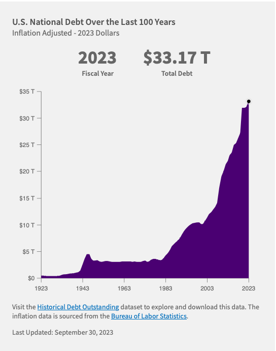
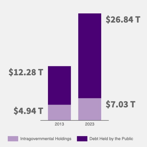
It is fashionable to show people scary graphs showing the national debt is rising like a hockey stick (See Exhibits A and B, below)1 and to argue that our runaway debt is going to trigger spiking interest rates, a financial collapse, global deflation/depression, or the end of life on earth. Everyone is entitled to their own opinion about spending, deficits, and debt. For my part, I would like to see all three lower than they are today. But that doesn’t make them scary. And scaring people doesn’t make them better investors.


Debt is one of those words that everybody hates. Heck, I don’t like it either. But it’s also true that without credit, the economy would be a fraction of its current size and people would be a lot poorer, both in income and in net worth.
The immense size of our balance sheet, $452 trillion2 in total assets at the end of last year, can help us put recent multi trillion dollar budget deficits in perspective. I’m going to lose friends over this but I’m going to suggest, below, that deficits would have to be much bigger than even today’s numbers to put significant upward pressure on interest rates.
A My-croeconomic Framework for thinking about debt
What analytical framework should we use to think about debt? I decided long ago that the GDP-centric version of macroeconomics taught in the graduate schools—so-called Modern Macroeconomics—isn’t good enough.3 So, we need a replacement.
I have only ever had two really good ideas.
My first good idea came 50 years ago when I discovered that the GDP accounts are chump change compared with stocks of assets that people already own and I learned that all big economic events originate in the balance sheet, not the GDP accounts. Over the years, I have developed a different, asset-centric, general equilibrium framework to replace it. I will explain it in full in later posts and in a book I am preparing now.
My second good idea came in the early 1990s when Bill Miller pointed me in the direction of the Santa Fe Institute, handed me a copy of Barabasi’s Linked, and suggested I learn about complex adaptive systems. I had just survived my first credit crunch as an investor—the S&L Crisis—where I learned that, in spite of what I learned in the textbooks, there are times when markets switch to non-price rationing and the prices you read in the newspaper tell you nothing about the true scarcity or availability of a product.
I read Barabasi’s book on the train on the way home, and a hundred more books since then on complex systems, network theory, criticality, population biology, epidemiology, meteorology, phase transitions, far-from-equilibrium thermodynamics, and the history of plagues and pandemics. And I developed a course for PhD students called Far From Equilibrium Economics and Finance.
I ended up with a picture in my head of a market economy as a far-from-equilibrium communications network that uses prices to transmit information about wants and scarcities to people who make production and consumption decisions, exactly as Friedrich von Hayek4 explained almost 90 years ago. That picture views economic activity is work produced by transforming the energy stored in natural resources, capital goods, knowledge and human effort into outputs of goods and services, guided by arbitrage opportunities reflected in relative prices.
And I learned that market economies, although extremely efficient, experience cascading network failures when prices fail to reliably transmit information. These information blackouts trigger the financial crises that cause recessions and depressions when the economy is forced to operate in a less efficient state until networks have had time to regrow broken links. In other words, economic downturns are not produced by changes in C + I + G; they are produced by network failures in the asset markets.
Two Economies, Not One
As I have written in previous posts, the are two economies, not one. One is the Flow Economy that produces goods and services. The other is the Balance Sheet Economy that stores wealth.
The flow economy is dynamic; you can think of GDP accounts as the economy’s Profit and Loss (P&L) statement. It measures what we are doing, using metrics expressed in dollars per year like consumption, savings, investment, government spending, taxes, net exports, and GDP. Things expressed per unit of time measure speed, like miles per hour on your car’s speedometer. So, GDP is a measure of how fast we are transforming inputs into goods and services.
The Balance Sheet Economy is static; it measures what we own, not what we are doing. Its metrics are expressed as stocks of assets that exist at a moment in time. For example, on December 31, 2022 there were 142 million existing homes in the U.S.
According to the Fed’s most recent Z.1 Financial report for Third Quarter 2023, on 12/31/2022 U.S. balance sheets were contained $322 trillion in financial assets and $143 trillion in tangible assets . That makes total assets $452 trillion, about 18x the value of 2022’s $25 trillion GDP.
It makes sense that the stock of total assets is such a big pile of stuff. You can think of it as the value of all existing raw materials, like land, oil, and timber, plus everything people have produced since the beginning of time that is still here (that hasn’t been consumed or worn out yet), plus all existing paper assets like bank accounts, Treasuries, corporate bonds, and equities.
The sheer size of the balance sheet is what makes it so important to understand. Even a minor change in the way people choose to hold their $452 trillion in assets can unleash market forces many times bigger than the C + I + G shocks arising in the GDP accounts.
How Asset Markets Work
Asset markets are much easier to understand than product markets because supply is fixed. They obey three simple rules:
The supply of an asset is simply the stock that already exists. It does not depend on price.
All assets have to be owned by somebody all of the time.
The market price will be whatever it takes to make people willing to own the stock of existing assets.
In other words, in an asset market, supply is perfectly inelastic and the price is entirely demand-determined. So, how does demand work?
Demand is simple too. Figure 2 shows a simple version of what I think of as the Fundamental Equation of Asset Markets. An investor’s job is to decide how to allocate their initial net worth (NW) among the different assets available to them. You can think of Net Worth as a pie and the investor’s job is to decide how to slice it. Figure 2 says they will choose how of asset i (Ai) to own, by comparing its rate of return with the returns available on all other assets.5
For the overall economy, Net Worth is equal to the market value of the stock of tangible assets—the stock of tangible assets (ta) times their market price (Pta)—because each financial asset is cancelled by an equal, offsetting liability.6 The two rows at the bottom of Figure 2 tell us that the demand for asset i, say government debt, at given interest rates, will increase in direct proportional to increases in net worth. We will make use of that fact below.
How Does Debt Fit In?
To understand how the national debt fits in, we are going to do a simple mental experiment.
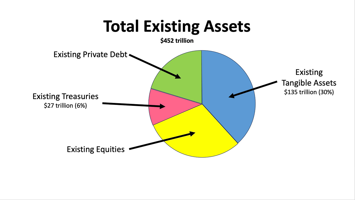
Start with a balance sheet that is in equilibrium, i.e., one where the people who own all of the existing assets are happy to continue to own them at current market prices. The pie chart in Figure 3 shows that on the last day of 2022 people had divided their total assets into four buckets. The existing stock of tangible assets ($135 trillion) made up 30% of total assets. The existing stock of Treasuries, i.e., the national debt ($27 trillion)7 made up 6% of total assets. And they divided the remaining 64% of their holdings between Existing Private Debt (bank accounts, bonds, and other fixed income assets) and Existing Equities (common and preferred stocks, private businesses and other equity-like assets).
Our assumption that people are happy to continue to their existing assets at current prices tells us that asset markets are in equilibrium; there will be no pressure for asset prices or interest rates to rise or fall.
Now let’s look at what happens when a year goes by. In Figure 4, above, the market value of the stock of tangible assets at the end of the year has increased for two reasons. First, physical stocks of tangible assets increase because we produce new houses, office buildings, factories, capital goods, and durable goods, faster than they wear out (depreciate). Second, tangible asset prices may rise over time as well. The resulting rise of net worth increases the demand to hold all other assets in proportion, as indicated in Figure 2.
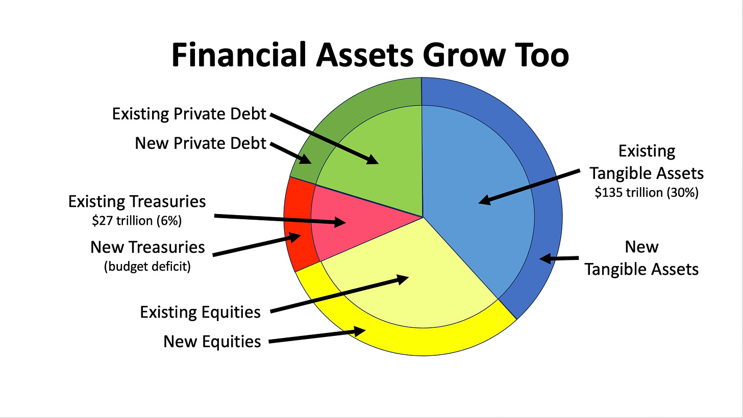
In the real world, of course, financial assets grow over time as well. Figure 5, above, shows what the distribution of total assets would be like after one year in the hypothetical case where each category of financial asset has grown in proportion to the increase in net worth.
The stock of equities increases, for example, because owners of firms issue more shares through IPOs and secondary sales, because their prices have increased to reflect increases in free cash flow, and because people have founded new businesses.
The stock or private debt increases because companies borrow to finance new capital goods, because people take on new mortgages to finance new homes and new office buildings, and because businesses increase credit lines to access new working capital to finance increases in production.
And the stock of Treasuries—the national debt—increases as the Treasury issues new securities to pay for the gap between government outlays and receipts. We call new Treasuries the budget deficit.
I have drawn the special case represented by Figure 5 so that the budget deficit is just big enough to allow the stock of Treasuries, i.e., the national debt, to increase in proportion to the increase in net worth. In other words, Figure 5 illustrates the case where the increase in the supple of Treasuries just equals the increased demand for Treasuries driven by increased net worth. We can refer to this as the interest rate neutral budget deficit, the amount of new government borrowing that will put neither upward nor downward pressure on the level of interest rates. Let’s put some parameters on the size of the interest rate neutral budget deficit.
Over the past 35 years, Household Net Worth has grown at an average of 6.2% per year, as shown in Figure 6 . If we apply that figure to Figure 5, we can estimate the increase in net worth to be ($ 8.4 trillion) and the interest rate neutral budget deficit to be $1.7 trillion, which results in the national debt increasing by 6.02%, in line with net worth growth.
I want to repeat that statement because it is the punchline of our analysis. The rise in the value of tangible assets (net worth) over time increases the demand to hold all other assets, including government securities, in direct proportion. If net worth next year were to rise by 6.2% next year—its average rate over the past 35 years—a budget deficit of $1.7 trillion would leave interest rates unchanged. That is, the interest rate neutral budget deficit today is roughly $1.7 trillion per year, roughly in line with current estimates of actual figures.
It is worth mentioning that these figures are based on debt held by the public ($26.84 trillion) in Figure 1. If we were to use total outstanding debt, our estimate of the interest rate neutral budget deficit would be somewhat higher ($ 2.0 trillion).
It follows, of course, it follows that a budget deficit larger than this amount would put some slight upward pressure on interest rates and that a budget deficit of, say, $1.4 trillion would put some slight downward pressure on interest rates.
Conclusions and Investment Implications
Let me start by saying that this analysis does not say that we should love big budget deficits or worship the national debt. Whether government spending, deficits, and the national debt should be bigger or smaller depends on your view of the value provided by government outlays and the impact of tax rates on people’s behavior. It simply says we should remember that we should think of deficits and the national debt in terms of their impact on the balance sheet, that the balance sheet is very large, and that the bar for measuring the impact of deficits on interest rates is very high.
It also says that we should be look at debt relative to net worth, not debt/GDP ratios when assessing the budget, and that hockey stick charts like Figure 1 have little meaning.
As investors, we need to know two things to make investment decisions. The first is how we think about markets. The second is how everyone else thinks about markets, because that is what will set the prices we shop from. Only when we reach different conclusions than the herd will we find opportunities to buy assets at bargain prices. The upshot of this analysis is that, the next time scary headlines about budget deficits push Treasury prices lower, we should be buyers, not sellers, into the news.
Dr. John
I should mention that the two graphs are not measuring the same thing. The one on the left measures total outstanding debt at the end of each fiscal year (fiscal 2023 ended on 10/31/23). The one on the right gives two measures of the national debt (total outstanding debt and debt held by the public, not by government agencies).
The best source of data on balance sheets is the Fed’s quarterly report Z.1 Financial Accounts of the United States: Flow of Funds, Balance Sheets, and Integrated Macroeconomic Accounts. Total Assets can be broken into Total Financial Assets and Total Non-financial Assets. Total financial assets on 12/31/2022 of ($317 trillion) is reported at the top of column 15 on page 3. Total non-financial (tangible) assets on 12/31/2022 of ($135 trillion) is reported in the U.S. Net Wealth row at the top of page 8. Together, they add up to ($452 trillion) in Total Assets. This number is certainly an understatement because the estimates exclude the value of all land and other non reproducible assets (oil, gas, coal, copper, timber, etc.) owned by federal, state and local governments. To put the point in perspective, the federal government alone owns more than 700 million acres of land.
As a rule of thumb, any framework that calls itself “Modern” is a load of bunk; that includes Modern Portfolio Theory, Modern Macroeconomics, and Modern Monetary Theory.
In my Far from Equilibrium Economics and Finance course, the first two articles I have my PhD students read are Friedrich von Hayek’s Economics and Knowledge (1937) and The Use of Knowledge in Society (1945), von Hayek’s classic papers that describe a market economy as a solution to the division of knowledge problem. The third article I have them read is Irving Fisher’s The Debt Deflation Theory of Great Depressions (1933) that explains what happens when the communication network we call the market economy collapses.
I have left out all the other things people think about when they decide what to own, e.g., taxes, risk, and any benefits an asset provides, like the value of living in your house or looking at a painting. People will take all of these things into account when making decisions. For this post, I want to concentrate two things: 1) there will be a structure of returns that will leave owners content to own the existing assets, i.e., that an equilibrium exists (equivalent to the first law of thermodynamics) and 2) that significant departures from that structure of returns will cause people to attempt to change their asset mix, selling some of one asset to buy some of another asset, which will force changes in their prices (equivalent to the second law of thermodynamics.)
This is the assumption the Fed makes when t hey calculate U. S. Net Worth on page 8 of the Z.1 report. This procedure effectively values corporations and other businesses at their tangible book value. As an alternative, one could value businesses at market value, which would increase net worth by the excess of market value over book value. We will explore that in a separate post.
As you can see in Figure 1 for , a portion of the total national debt is owned by government agencies; the rest is owned by the public. The $27 trillion figure I have used here represents debt held by the public at the end of 2022.


I appreciate calm explanations of things which other people (and the media) enjoy making alarming. Alarming is fun and gets clicks, but calm is more likely to lead to long-term understanding and consideration of complex topics!
Thanks Steve. Means a lot from you. Hope our paths cross again soon. John